Visual identity for MafertBrand
Brand
Mafert is an innovative technology company specializing in the automation and optimization of processes in small and medium-sized engineering firms.
Mafert Solutions was established in response to the needs of engineering companies seeking efficient and practical software solutions without unnecessary complexity. The company focuses on developing software that enables:
– Recording and monitoring of production processes
– Automation and digitization of workflows
– Optimization of human resource utilization
– Reduction of errors and costs
Through long-term collaboration with companies and detailed analysis of their business processes, Mafert Solutions develops software that enhances efficiency and productivity.
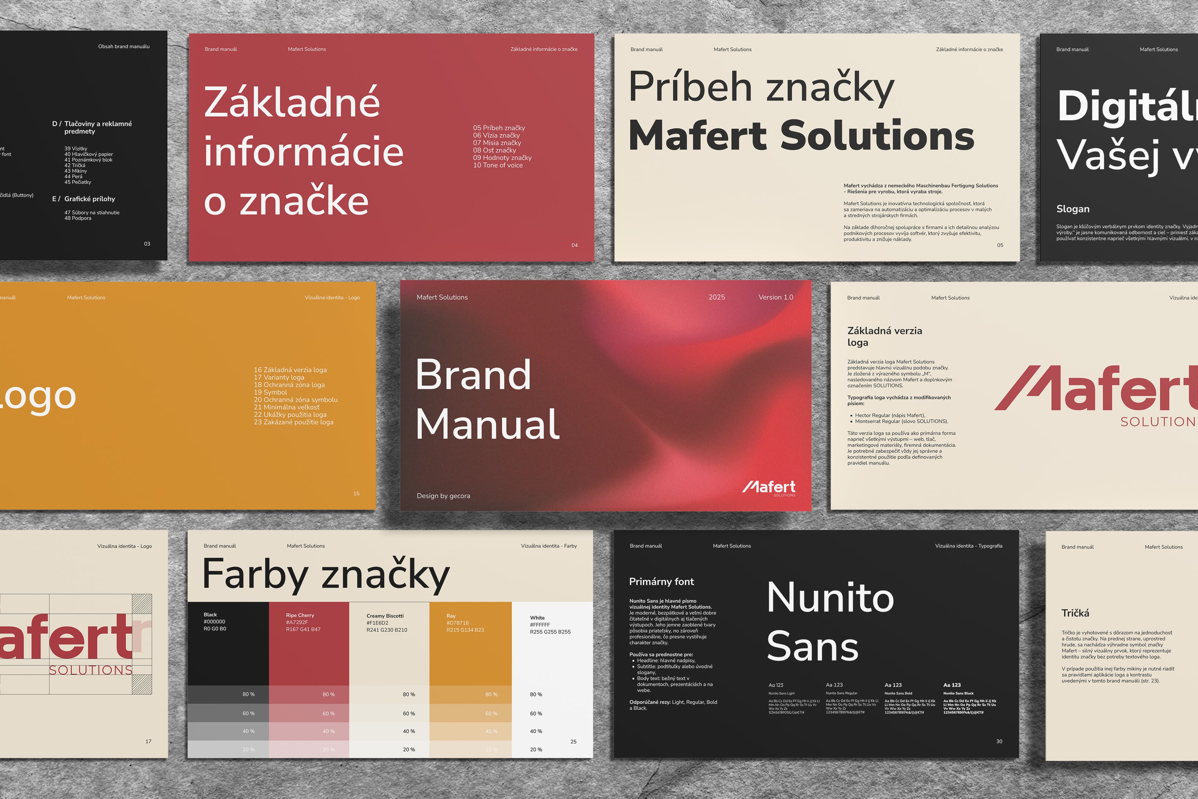
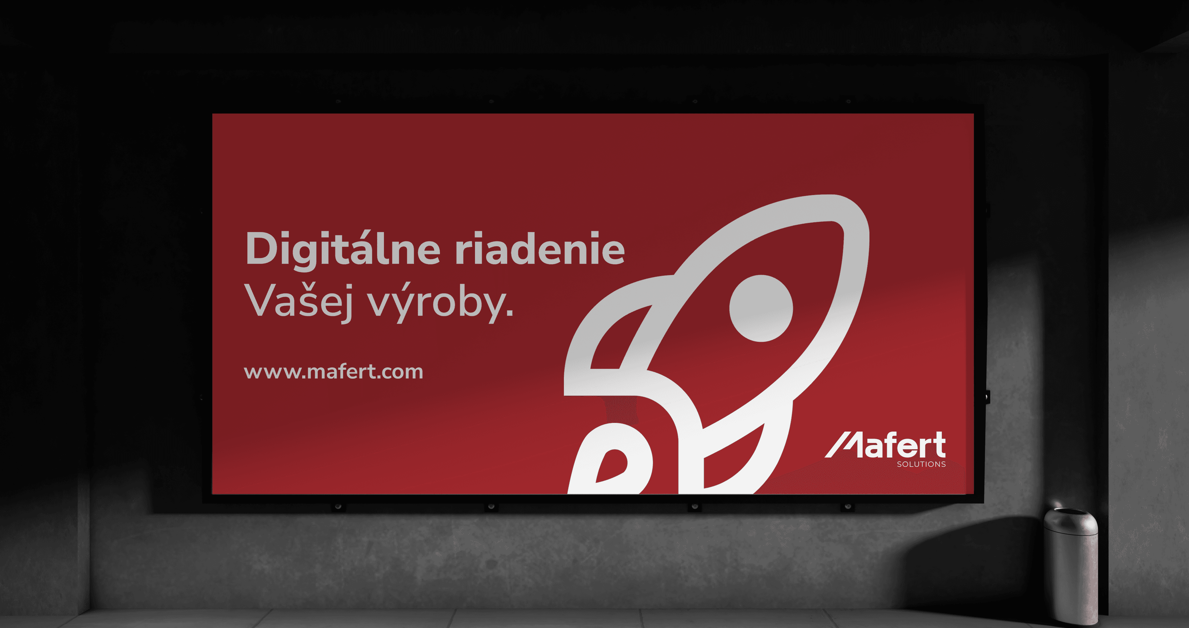
Our collaboration with the technology company Mafert Solutions focused on developing a comprehensive visual identity and brand manual that accurately reflect their expertise in automation and digitization of production processes in small and medium-sized engineering firms. The goal was to build a brand that clearly communicates technological proficiency, exudes trust and professionalism, and ensures visual consistency across all communication channels.
The logo of Mafert Solutions is based on the letter “M”, which serves as the core element of the logo. Its distinctive upward tilt visually symbolizes growth, progress, and continuous advancement towards better results. This dynamic shape is intentional; it embodies the brand's philosophy centered on technologies that help customers grow, digitize, optimize, and streamline their business operations.
The “M” symbol can also be used independently while maintaining a strong visual identity and immediate recognizability. However, it's essential that the symbol is used exclusively in accordance with the rules defined in this manual, including clear space, color usage, and proportions.
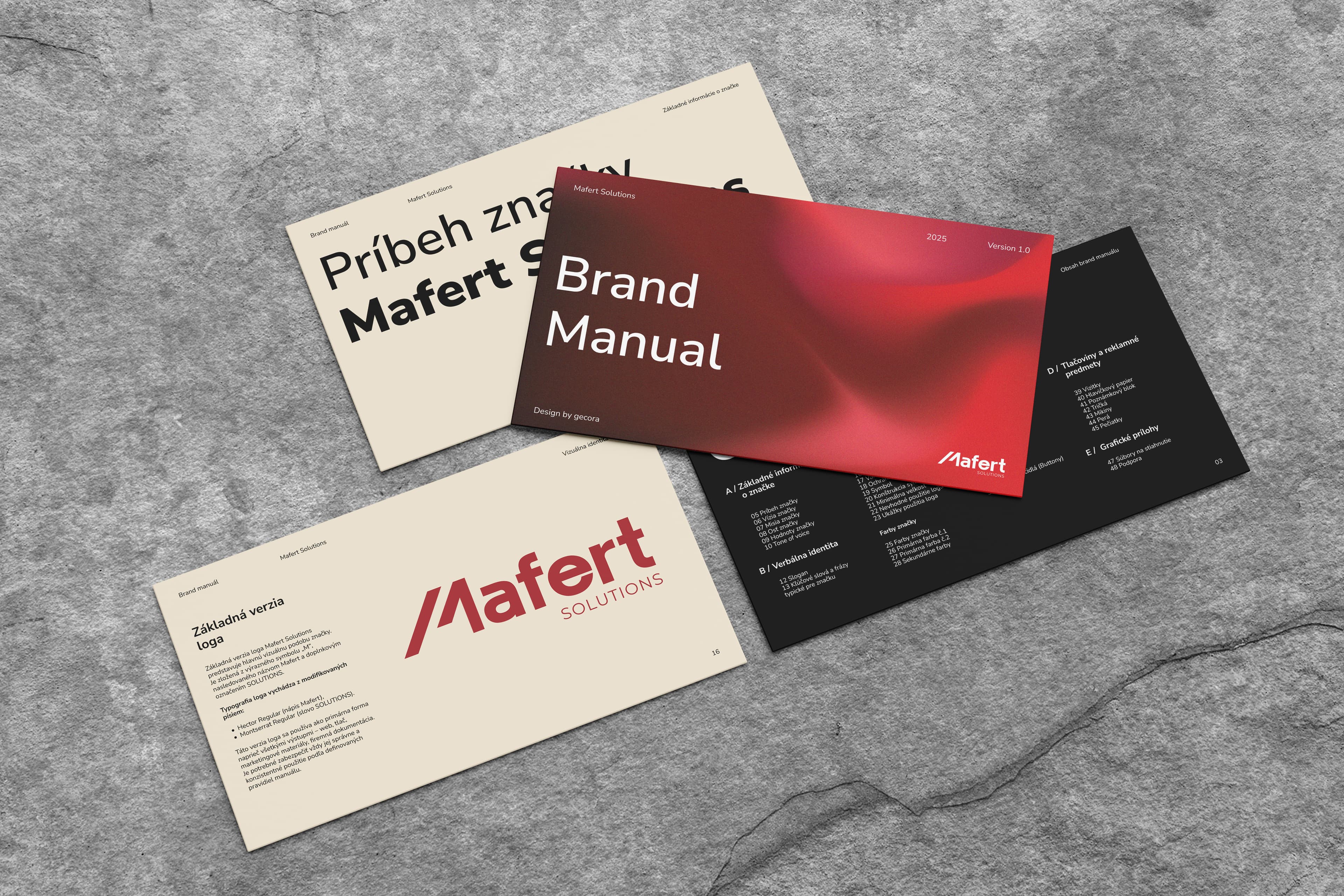
Within the brand manual, we defined key elements of the visual identity, including the logo and its variants, color palette, typography, rules for using visual elements, and templates for marketing and corporate materials. This document will serve as the foundation for a unified and effective visual communication of the Mafert Solutions brand.
Our work focused on creating a consistent visual style that reflects the company's brand and enhances the overall user experience. We aimed to design in line with best practices in UX/UI design, ensuring that the Mafert Solutions brand appears professional and trustworthy across all communication channels.
The result of our work is a modern and effective visual identity that supports the business growth of Mafert Solutions and enhances their customers' experience.
An easily identifiable brand is essential.
Our collaboration in creating the visual identity and brand manual will ensure that their brand consistently and professionally communicates their values and expert focus.
 CEOViktor