Visual identity for odmityBrand
Brand
Odmity je no-code platforma na rýchlu tvorbu a správu back-end riešení bez potreby programovania, ktorá umožňuje jednoducho definovať objekty, API a ich vzťahy. Vďaka intuitívnemu rozhraniu a flexibilite skracuje čas vývoja, odbremeňuje vývojové tímy a podporuje škálovanie projektov podľa potreby.
Odmity is a no-code platform designed for building and managing back-end solutions without the need for programming. It was created in response to the need for faster, simpler, and more flexible custom system development.
The platform allows you to:
– Define data objects and their relationships without code
– Create and modify APIs intuitively and instantly
– Manage CMS, CRM, and other systems without lengthy development
– Scale solutions according to project and client needs
Thanks to its user-friendly interface and automated processes, odmity relieves development teams from repetitive tasks and lets them focus on what truly matters – project logic and functionality.
Fast back-end without coding.
Short, clear, and to the point. The brand claim of odmity highlights its core value – accelerated development, simplified workflow, and scalability without the need for developer involvement. Perfect for developers, product managers, and startups who need a functional back-end without delay.
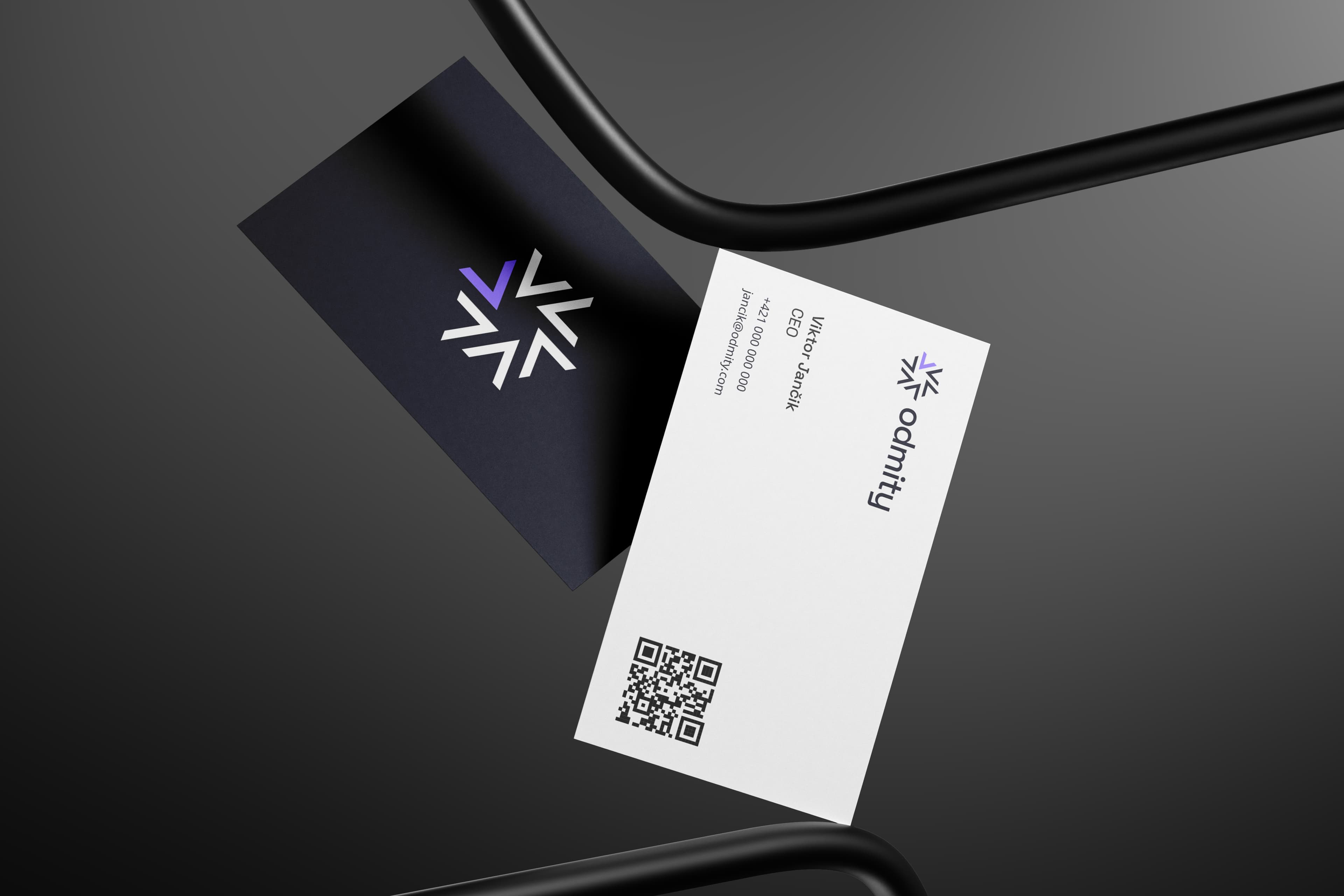
Our collaboration on the odmity project focused on developing a complete visual identity that reflects a modern approach to no-code back-end development. The odmity platform enables users without programming skills to build and manage objects, APIs, and their relationships quickly, intuitively, and at scale. The goal was to create a brand that clearly communicates technological simplicity, flexibility, and efficiency in building data-driven solutions.
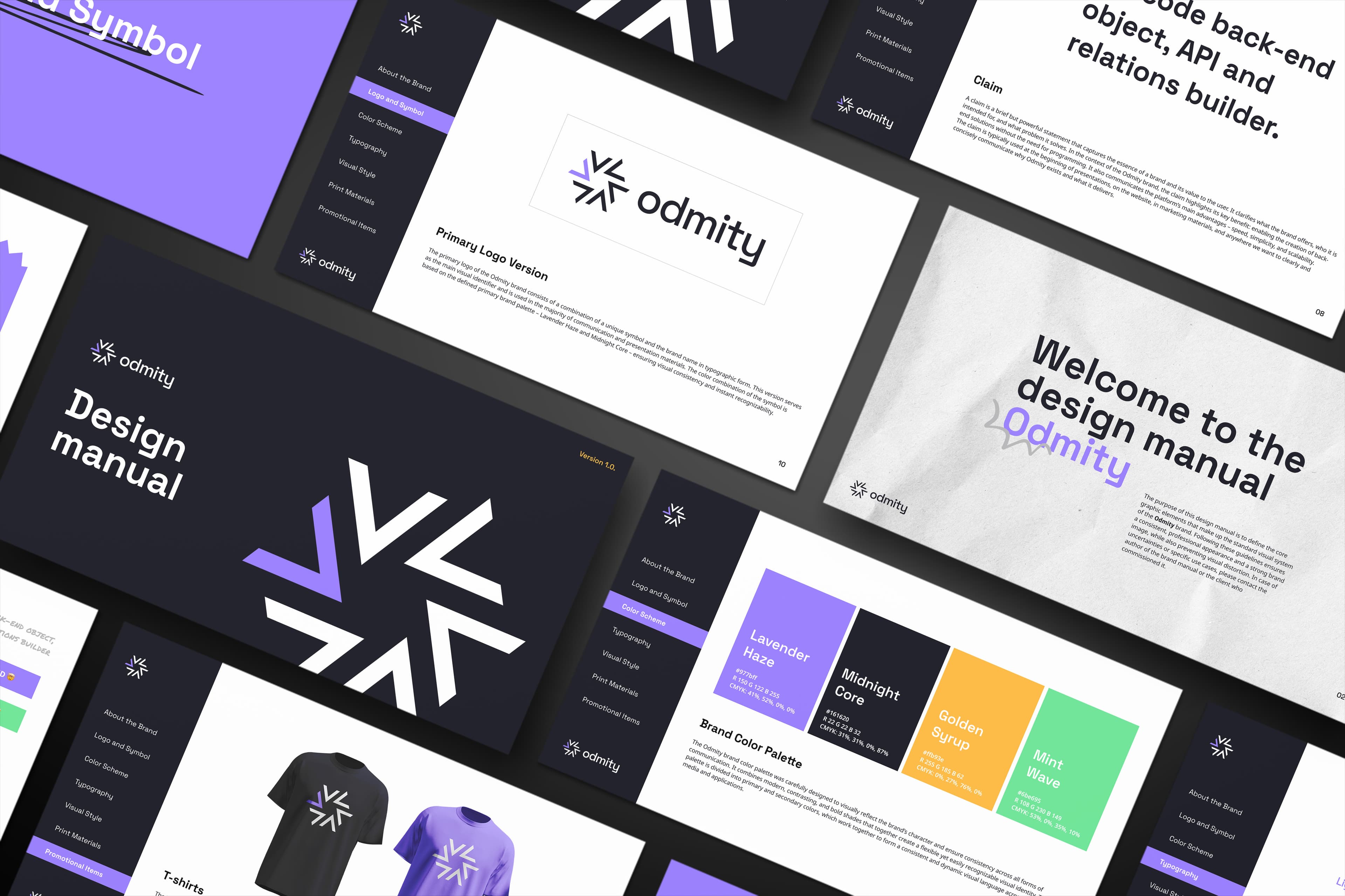
The core odmity logo is based on a combination of typographic elements and a unique symbol that conveys interconnectedness and the logical structure of data entities. The color palette is derived from shades of Lavender Haze and Midnight Core, giving the brand a modern yet technical feel. This strong visual language allows for clear brand recognition across all channels.
The odmity symbol also functions as a standalone visual element – ideal for use in places where the full logo isn’t applicable (e.g., social media, icons, mobile interfaces). Even in these cases, the original color scheme, clear space, and visual balance of the symbol are always maintained.
As part of the brand manual, we defined all the key components of the visual identity – from logo variants and the color palette to typography, icon style, templates, and graphic usage guidelines. The identity is built on a combination of dynamic and playful elements (e.g., stickers, annotations, interactive buttons) that enhance accessibility and open the brand to a broader audience.
A distinctive feature of the identity is its approach to interactivity – primary buttons change color from purple to green on hover, emphasizing the system’s technical responsiveness and agility. This approach increases user engagement and reinforces the impression of a lively, active environment.
The result of our work is a consistent and flexible visual identity that strengthens odmity’s market presence and reflects its core benefits – speed, simplicity, scalability, and a no-code approach to back-end development.
Simplicity and recognition are the foundation of a strong brand.
Through our collaboration on the visual identity and brand manual, we established a solid foundation for clear, consistent, and professional brand communication that reflects its core values.
 CEOViktor